Inside three fantastic remodel projects around the state, including an architect-designed beach house, a prefab cabin in the woods and a historic city loft
written by Melissa Dalton
Creativity, elbow grease, patience. All home renovations have the same requirements. We step inside three fantastic remodel projects around the state, including an architect-designed beach house, a prefab cabin in the woods and a historic city loft. What else do they have in common? Homeowners who love where they live.
For three years, Cole and Lea Anne Gerst sought a little piece of coastal property to call their own. They came close to buying a different house before they found a true gem. “Cole is a designer. I could tell that his eyes did not light up on the previous property,” Lea Anne Gerst said. “When we went and saw this home, his eyes just went crazy.” Their find was special because it had been designed by a Portland-based Mid-century modern architect named Marvin Witt, and built with his sons in the early ’80s as a personal family getaway. The Gersts—he’s a product designer and she’s a project manager at a design agency—are the second owners.
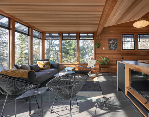
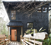
The home sits on a hillside above Manzanita, rising three stories with corner decks on each level, giving it a treehouse feel. The bedrooms are on the lower floors and the shared living spaces on the top. Though there were plentiful windows overlooking the ocean and cedar lining the walls, there was also failing window glass, sections of unfinished flooring and water damage in the ceiling. “It looked like no one had been there in a long time, but structurally it was solid,” Cole Gerst said.
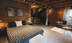
In 2017, the couple initiated a year-long remodel to bring the house back to life. Exterior railings were rebuilt to code, as was a new internal staircase. They converted a second-floor powder bath into a wet room, tiling every square inch of wall in a modern grid and maximizing an awkward layout with a petite corner sink, to make it a full bath. Kitchen storage and counter space was expanded with a custom island. The old carpet in the living and dining areas was exchanged for large-format ceramic tile. Through it all, they maintained a streamlined black, white and charcoal scheme that offsets the beautiful wood, which they also had installed in the lower-level ceilings for a cohesive experience. “We wanted the house to shine and not over-decorate,” Cole Gerst said.
At the time of purchase, the house’s qualities attracted multiple offers. “Ours was the lowest, but [Witt] knew that we were artists, and when it came down to making a decision, he said he wanted the artists to have the house,” he said. With that in mind, the couple strived to take a light touch with the remodel and maintain the essence of Witt’s design. “We wanted to be very respectful of the original intent and not overdo it,” Lea Anne Gerst said. “Because when we first saw it, we both fell in love.”
Hide the TV
Cole Gerst designed a chic spot on the back of the kitchen island to ensure the television wouldn’t be the room’s focal point. If doing the same, he recommends choosing the TV model first so you can tailor the cabinet to its dimensions. He opted to center the screen between black cabinet doors for pleasing symmetry, and to sync the display with the kitchen. Of course, don’t forget to test sightlines when you have a spot picked out. “We made sure you could see it from multiple points in the room,” Cole said.
Thirteen years ago, Jeff Weithman had a quest. On Friday afternoons, the Portlander would load up his toddler in the car and go for a drive. Sometimes they would head to Mount Hood, or cruise along the Columbia River, or motor up and down the coast. Weithman’s goal for these trips? To find a cabin.
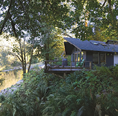
Weithman spent his early childhood in Wisconsin, where he and his family frequented a neighbor’s Eagle River retreat. “I wanted to find a place where I could create an experience like that for my kids,” Weithman said. One summer day he was driving toward Tillamook and found it—a 1967, prefab cabin that oversees a stretch of the Wilson River, nestled in the Tillamook State Forest.
Weithman and wife Tess Darrow, who founded Egg Press, lived with the 600-square-foot cabin for five years, pondering the question of whether to expand. They hired an architect and discussed bumping out the back. “Finally, we just said, ‘Let’s work with what we have and make it as efficient as possible,’” Weithman said.
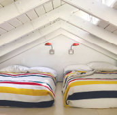
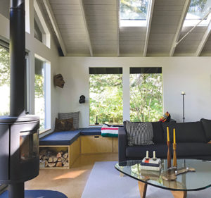
They gutted the cabin in a top-to-bottom remodel, installing a 300-square-foot sleeping loft for the kids over the single bedroom and bathroom. The loft is accessed by a ladder that fits neatly into a thick plywood framework surrounding the kitchen, with the last step up on a platform suspended over the fridge. A 13-foot island wrapped in butcher block offers seating and plenty of prep space. In the living room, they made the window pattern symmetrical by mirroring the units on the river-facing façade on the adjacent walls, adding built-in window seats to create cozy nooks, and fitting in a wood stove with a tall stack, which leads the eye up to the clerestory windows.
The project was a communal affair, with Darrow sewing cushions and their furniture designer friend Reed LaPlant crafting the window seats and waterfall island top. Simple subway tile, plywood paneling, cork flooring and Ikea buys further stretched the budget. Later, the couple converted a carport into a guesthouse, so the cabin can sleep up to twelve.
Now, it’s the ideal getaway for any time of year, whether winter suggests curling up in front of the fire, or it’s summer and catching newts and fishing in the river is on the agenda. “It keeps us on the analog side of things,” Weithman said. The experience even inspired a career change, as he left a position as a creative director at Nike to become a real estate agent specializing in modern living, especially via unique Mid-century or modern finds. “I like helping people envision the possibilities,” Weithman said. “That’s what we did with this cabin project.”
Sew a Simple Pillow Case
1. Start with an insert that measures 15 inches x 15 inches.
2. Cut a piece of fabric to be 16 inches x 34 inches.
3. On either of the short ends, fold over a half-inch of fabric, and press flat with an iron. Sew a line to create a finished edge.
4. Lay fabric so the pattern faces up. Fold one end over 10 inches, then fold the opposite end over 8 inches, so they overlap. Sew the outside edges, only coming in a ½-inch.
5. The finished cover should be 15 x 15 inches, or a little smaller for a tight fit. Turn the cover right side out and stuff the insert inside.
About a year after Kathryn and Matt Richards moved into their loft in a historic building in Northwest Portland’s Alphabet District, a fire started on a balcony next door and spread to the roof. “There were 10- to 15-foot flames coming out of the building,” Matt Richards said. “We all thought it was going to go down completely.” Thankfully, no one was hurt and the building was saved, but the ensuing damage from flames, smoke and water was extensive. When the couple, who have two children, learned they would be displaced for eleven months for the repairs, they decided to remodel during the vacancy.
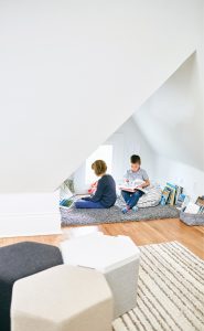
Their building is a stately Victorian built in 1883, listed on the National Register of Historic Places, and divided into condos in 1999. The Richards’ apartment is in the former attic, making for some awkward sloped ceilings with unused nooks formed by the low angles. “When we first moved into the building, we knew we needed help with the layout and design, just because it’s a big open space and the sloped ceilings aren’t always functional,” Richards said. The couple tapped Guggenheim Architecture + Design Studio to get the tricky spaces right. “We talked about how to work the angles to our advantage and use them as a design element, as well as how to capture more space in a small footprint,” interior designer Jenny Guggenheim said.
To start, they didn’t change the loft’s 1,720-square-foot layout, just better used the “weird dead spaces,” as Richards called them. In the kitchen, cabinets that made the room feel small and dark were swapped for customized cabinetry, a hard-working island, and open shelves. Then a previously unused alcove received a built-in window seat packed with drawers and cubbies. Now it does everything from display cookbooks and hide the Cuisinart to give the kids a spot to grow plants on the windowsill or chat with their parents while they’re cooking.
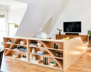
In the living room, Guggenheim designed a custom sectional that cleverly divides the long space into designated areas for TV-watching or dining, then backed the sectional with eye-catching shelves with triangular lines. “It was kind of a cheeky play off all of the angles in the home,” Guggenheim said. In the bathroom, sleek built-in storage replaced ad-hoc wire bins, while a hexagon-shaped mirror and modern hex floor tile further embrace the angles. The Richards couldn’t be more pleased with the results: “It just feels so great to wake up living in a place that has so much thought put into it,” Kathryn Richards said, “a place that looks good and works well.”


